
Table of Contents
ToggleChoosing the right paint color can completely transform a room, or leave you staring at walls you regret. With thousands of color options available and new trends emerging each season, narrowing down choices feels overwhelming. But paint is one of the most affordable and impactful DIY upgrades a homeowner can tackle, typically running $30–$60 per gallon for quality interior paint with coverage of about 350–400 square feet. This guide breaks down practical color selection strategies, current trends, and room-specific recommendations to help homeowners make confident decisions that fit their space and lifestyle.
Key Takeaways
- Interior paint color ideas should be tested on actual walls in 2’×2′ samples for at least 48 hours under different lighting conditions before committing to a full room—colors shift dramatically based on natural and artificial light.
- Trending interior paint colors for 2026 favor warm neutrals with pink, peach, or terracotta undertones, sage greens, soft dusty blues, and creamy off-whites over cool grays and stark whites.
- Choose paint sheen strategically: flat finishes for low-traffic areas, eggshell for living spaces, satin for kitchens and bathrooms, and semi-gloss for high-moisture trim and doors.
- Lighter paint colors make small spaces feel larger and reflect light, while darker shades create cozy, intimate atmospheres—balance ceiling height and room size when selecting your palette.
- Bedrooms benefit from calming colors like soft blues, muted lavenders, and warm neutrals that promote rest, while kitchens require durable satin or semi-gloss finishes that withstand splatter and need repainting every 3–5 years.
- Accent walls and two-tone paint techniques add visual interest without overwhelming a space—apply darker shades to one wall or the lower third to create depth and architectural detail.
How to Choose the Right Paint Colors for Your Space
Start by assessing the room’s natural light. North-facing rooms receive cooler, indirect light that can make colors appear darker and more muted, while south-facing spaces get warm, consistent light that intensifies pigments. East and west rooms shift throughout the day, morning cool to evening warm.
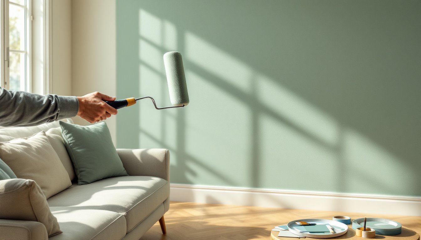
Test paint samples on the actual wall, not just paint chips. Purchase sample pots (usually 8 oz for $3–$6) and paint 2’×2′ squares directly on the wall. Observe them at different times of day and under both natural and artificial light for at least 48 hours. Colors shift dramatically depending on lighting conditions.
Consider the room’s existing finishes. Flooring, countertops, cabinetry, and trim all have undertones, warm (yellow, orange, red) or cool (blue, green, gray). Match or deliberately contrast these undertones. For example, honey oak floors pair well with warm taupes or greiges, while gray-toned luxury vinyl plank flooring works with cooler paint palettes.
Think about paint sheen alongside color. Flat or matte finishes hide imperfections but aren’t scrubbable, best for low-traffic areas and ceilings. Eggshell (10–25% gloss) offers slight washability for living rooms and bedrooms. Satin (25–35% gloss) works well in kitchens, bathrooms, and hallways where you need cleanability. Semi-gloss (35–70% gloss) suits trim, doors, and high-moisture areas.
Account for room size and ceiling height. Lighter colors reflect light and make small spaces feel larger, while darker shades absorb light and can make large rooms feel cozier. Low ceilings benefit from painting the ceiling the same color as walls or lighter to visually raise the height.
Trending Interior Paint Colors for 2026
Warm neutrals continue dominating 2026 palettes, but they’re shifting away from cool grays toward beiges with subtle pink, peach, or terracotta undertones. Think “greige” warmed up a notch, colors that feel inviting rather than stark.
Earthy terracottas and clay tones are gaining traction in dining rooms, powder rooms, and accent walls. These colors ground a space and pair exceptionally well with natural materials like wood, rattan, and linen. They work in both modern and traditional settings when balanced with crisp white trim.
Sage green and muted olive shades bring nature indoors without feeling too bold. These colors work particularly well in spaces with abundant natural light and complement both warm wood tones and cooler metal finishes. They’re showing up in kitchens, bedrooms, and home offices as calming alternatives to blues and grays.
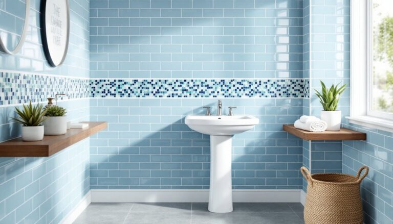
Soft blues remain popular but are trending lighter and dustier, less saturated than previous years. Think powder blue, sky blue, and robin’s egg rather than navy or cobalt. These shades work well in bedrooms and bathrooms where a serene atmosphere is the goal.
Warm whites and off-whites aren’t going anywhere. But, 2026 favorites lean toward creamy whites with yellow or beige undertones rather than the stark, cool whites of the past decade. These create a softer backdrop that doesn’t feel clinical and work throughout the home, especially in open-concept spaces where continuity matters.
Best Paint Colors for Living Rooms and Common Areas
Living rooms handle a lot, conversation, TV watching, entertaining, so paint choices need to be versatile. Warm greiges and taupes serve as excellent foundation colors because they’re neutral enough to accommodate changing decor but have enough warmth to feel inviting. They also photograph well if resale is on your mind.
For open-concept spaces that flow into kitchens or dining areas, maintain color continuity by using the same base color throughout but varying the sheen. Use eggshell in the living area and satin in the kitchen for easier cleanup while keeping visual cohesion.
Moody accent walls in deep green, charcoal, or navy can anchor a living room without overwhelming it. Apply the darker shade to one wall, typically the wall behind the sofa or the fireplace wall, and keep the other three walls in a lighter, complementary neutral. This creates depth without making the space feel closed in.
If the living room lacks architectural interest, consider painting the trim and walls in contrasting tones. Bright white or off-white trim against medium-toned walls (soft blue, sage, warm gray) provides definition without adding physical molding. This approach aligns with several interior design trends that emphasize architectural detail.
For high-traffic common areas like hallways and entryways, choose durable, scrubbable finishes in colors that don’t show scuffs. Mid-tone neutrals work better than stark white or very dark shades, which both show marks easily.
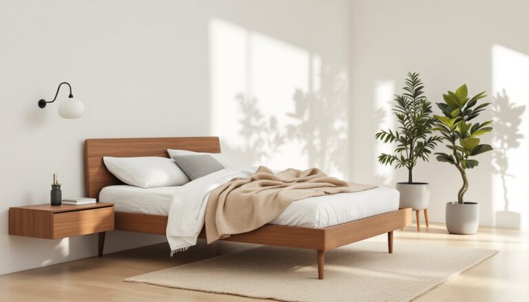
Bedroom Paint Color Ideas for Rest and Relaxation
Bedrooms benefit from colors that lower stimulation and promote rest. Soft blues and blue-greens have a documented calming effect and pair well with white bedding and natural wood furniture. Avoid overly saturated or bright blues, which can feel energizing rather than relaxing.
Muted lavenders and dusty roses create a soothing atmosphere without feeling overtly feminine when balanced with neutral bedding and furnishings. These shades work particularly well in rooms with good natural light. Resources like serene bedroom paint colors offer extensive visual examples of how these hues perform in real spaces.
Warm neutrals, beige, greige, soft taupe, work in virtually any bedroom and provide a versatile backdrop for changing decor. They’re especially practical in guest rooms or kids’ rooms that may need to transition as needs change.
For smaller bedrooms, lighter shades reflect available light and prevent the space from feeling cramped. If you want color, go lighter than your instinct suggests, paint always reads darker on four walls than it does on a sample card.
Dark, cocooning colors like charcoal, deep navy, or forest green can work in larger bedrooms with ample natural light, creating a restful, enveloping atmosphere. But, this approach requires commitment, test extensively before painting all four walls. Consider starting with one accent wall behind the bed to see how you respond to the color at different times of day.
Kitchen and Dining Room Color Schemes
Kitchens need durable, washable paint. Use satin or semi-gloss finishes on walls to handle splatter and grease. Even the best kitchen paint will need touch-ups or repainting every 3–5 years depending on cooking habits.
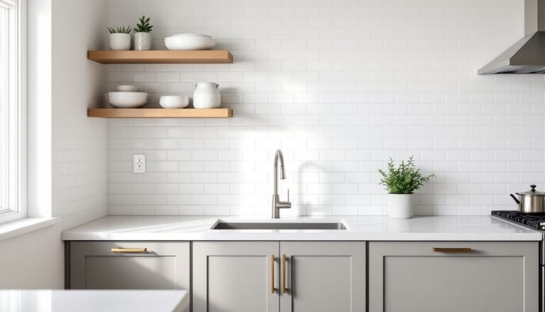
Soft white or warm off-white remains the most popular kitchen wall color because it maximizes light, makes spaces feel clean, and doesn’t compete with cabinetry or backsplash tile. If cabinets are white or light-colored, a slightly warmer wall color (cream, ivory) prevents the space from feeling sterile.
For kitchens with wood or darker cabinets, consider light-to-medium greiges, soft grays, or even muted greens that complement the wood tones. These colors add personality without overwhelming the space or making it feel dark.
Dining rooms can handle more drama than kitches since they’re not work zones. Deep tones like charcoal, olive, terracotta, or navy create an intimate atmosphere that works well for evening entertaining. Pair dark walls with lighter ceilings (white or off-white) to prevent the space from feeling cave-like.
If the dining area is part of an open floor plan, maintain visual flow with the adjacent spaces while still defining the dining zone. One approach: use the same base neutral throughout but add an accent wall in the dining area using a deeper or more saturated version of the main color.
Many homeowners researching DIY home decor projects are adding interest to dining spaces through two-tone walls or wainscoting painted in contrasting colors, typically a darker shade on the bottom third with a lighter color above.
Creative Accent Wall and Two-Tone Paint Ideas
Accent walls add visual interest without the commitment of painting an entire room. Choose the wall that naturally draws attention, behind the bed, the fireplace wall, or the wall you see when entering the room. Don’t automatically pick the longest wall: pick the one with the most purpose.
When selecting accent wall colors, go two to three shades darker than the other walls using the same color family, or choose a complementary color entirely. A room painted in soft gray can handle an accent wall in charcoal, deep teal, or even rust orange depending on the overall design direction.
Two-tone walls (also called color-blocking) work well in dining rooms, bedrooms, and hallways. Install a chair rail or simply measure and tape a horizontal line 32–36 inches from the floor. Paint the lower section in a deeper, more durable color and the upper section in a lighter shade. This visually lowers tall ceilings and adds architectural interest to plain walls. Many techniques explored on home design inspiration sites show how this approach transforms basic rooms.
Geometric accent walls using painter’s tape can create modern patterns, stripes, chevrons, or color-blocked rectangles. This requires careful measuring, quality painter’s tape (3M ScotchBlue or similar), and patience. Let the base coat dry fully (24 hours minimum) before taping, and remove tape while the top coat is still slightly tacky to avoid pulling up dried paint.
Another option gaining traction with interior design enthusiasts: painting the ceiling a color other than white. This works particularly well in powder rooms, walk-in closets, or kids’ rooms where you can experiment without major consequences. Keep wall colors light if you go bold on the ceiling.
Conclusion
Paint selection doesn’t have to be paralyzing. Focus on how the room functions, test samples in actual lighting conditions, and don’t rush the decision. Quality paint costs $30–$60 per gallon but lasts 7–10 years with proper application. Take time on prep work, cleaning walls, patching holes, priming when needed, because that’s where most DIY paint jobs succeed or fail. The right color makes a room feel intentional, not accidental.