Table of Contents
ToggleBuilding a website for your home design business or DIY blog isn’t much different from tackling a kitchen remodel, you need the right plan, quality materials, and careful execution. But before you start wiring up plugins or framing content, you’ve got to nail the foundation: your color scheme. A sloppy palette is like mismatched trim paint throughout a house, visitors notice, even if they can’t articulate why something feels off. Getting your web design color scheme right doesn’t require a degree in graphic design, just a solid understanding of how colors work together and which combinations serve your goals. This guide walks through the essentials, from color wheel fundamentals to practical tools that help you build a palette as cohesive as a well-planned room.
Key Takeaways
- Web design color schemes influence user perception within 50 milliseconds, making them crucial for establishing credibility and guiding visitor behavior on home improvement and DIY sites.
- Understanding color theory fundamentals—including the color wheel, saturation, value, and WCAG 2.1 contrast ratios (4.5:1 for normal text)—enables you to build harmonious, accessible palettes without guesswork.
- Choose a color scheme structure that matches your content and audience: monochromatic for clean professionalism, analogous for comfort, complementary for bold contrast, and triadic for balanced vibrancy.
- Align your color scheme with your brand identity and audience context—earth tones for sustainable DIY, cool metallics for luxury renovations, and test across devices and lighting conditions for readability.
- Use free tools like Adobe Color, Coolors, and Paletton to generate and experiment with palettes, then document your color scheme with hex codes, intended uses, and contrast ratios to maintain consistency.
- Account for color vision deficiency (affecting roughly 8% of men) by avoiding color-only information cues and using icons, labels, or patterns alongside color to ensure accessibility for all visitors.
Why Color Schemes Matter for Your Home Design Website
Color dictates how visitors perceive your site the moment it loads. Research shows users form opinions about a website within 50 milliseconds, about as fast as you can squeeze a caulk trigger. That snap judgment hinges heavily on visual design, and color carries most of that weight.
For a home improvement or DIY site, your palette communicates credibility and expertise. A well-chosen scheme signals that you know what you’re doing, the same way clean miter cuts and consistent paint lines telegraph craftsmanship in a physical space. Muddy colors or clashing combinations make visitors question whether your renovation advice is equally careless.
Color also drives usability. High contrast between text and background prevents eye strain during long reads, critical when someone’s referencing your deck-building tutorial on a job site. Strategic accent colors guide attention to calls-to-action (subscribe buttons, download links, contact forms) without screaming like a fluorescent safety vest.
Beyond function, the right palette reinforces your brand identity. Earthy tones and natural hues align with sustainable building content, while bold primaries might suit a modern home renovation blog. Consistency across pages builds recognition, much like using the same hardware finish throughout a house creates visual cohesion.
Understanding Color Theory Basics for Web Design
Color theory for web design borrows heavily from traditional art and interior design principles. At its core sits the color wheel, a circular diagram organizing hues by their relationships. Primary colors (red, yellow, blue) can’t be created by mixing others. Secondary colors (orange, green, purple) result from combining two primaries. Tertiary colors fill the gaps, mixing a primary with an adjacent secondary.
Understanding these relationships helps you build harmonious palettes instead of guessing. Warm colors (reds, oranges, yellows) advance visually and create energy, useful for call-to-action buttons or headers. Cool colors (blues, greens, purples) recede and calm, making them ideal for backgrounds and large text blocks.
Saturation and value matter as much as hue. Saturation measures color intensity, think a vibrant cobalt blue versus a muted slate. Value refers to lightness or darkness. A navy and powder blue share the same hue but differ drastically in value. Web accessibility standards (WCAG 2.1) require sufficient contrast ratios between text and backgrounds: at least 4.5:1 for normal text, 3:1 for large text. This isn’t optional, it’s code, like proper electrical box fill calculations.
The Color Wheel and Complementary Combinations
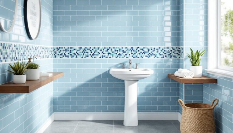
Complementary colors sit directly opposite each other on the wheel: red and green, blue and orange, yellow and purple. These pairings create maximum contrast and visual pop, similar to how a dark countertop against white cabinets makes both elements stand out.
For web design, complementary schemes work well in small doses. Use one color as the dominant background or base, the other as a strategic accent. A home design site might employ a soft sage green (#8FA88C) across headers and footers, with burnt orange (#C96912) reserved for buttons and linked text. Full-strength complementary schemes can vibrate onscreen if you’re not careful, think of it like pairing a fire-engine red front door with kelly green siding. It demands attention, but subtlety goes out the window.
Split-complementary schemes offer a gentler alternative. Instead of using the direct opposite, you pick the two colors adjacent to the complement. If your base is blue, you’d pair it with yellow-orange and red-orange instead of straight orange. This maintains contrast while reducing tension, much like choosing coordinating rather than matching throw pillows.
Popular Color Scheme Types for Home and DIY Websites
Different palette structures serve different purposes. Knowing the standard types helps you choose one that fits your content and audience rather than starting from scratch.
Triadic schemes use three colors evenly spaced around the wheel, think red, yellow, and blue. They’re vibrant and balanced but require careful distribution. One color should dominate (60% of the design), another support (30%), and the third accent (10%). This ratio prevents the scheme from looking like a kindergarten classroom.
Tetradic (double-complementary) schemes use two complementary pairs, offering rich possibilities but high complexity. These work best for sites with distinct content zones, say, a blog section versus a store. Most home design sites benefit from simpler approaches unless you’re managing a large, multi-category platform.
Looking at website color schemes examples from successful design publications can provide practical reference points. Sites like Design Milk demonstrate how minimalist palettes with strategic pops of color maintain visual interest without overwhelming content.
Monochromatic and Analogous Palettes
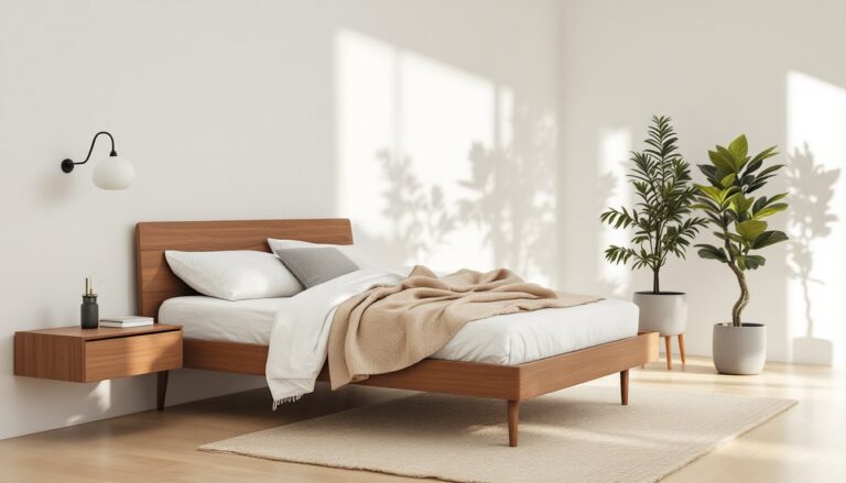
Monochromatic schemes use variations of a single hue, different tints (adding white), shades (adding black), and tones (adding gray). Picture a bathroom done entirely in blues, from pale powder-blue walls to deep navy accents. For websites, this creates instant cohesion and a clean, professional look.
A monochromatic palette for a DIY site might build around a medium green: #4A7C59 for headers, #A8D5BA for backgrounds, #2D5A3D for footer and text accents. The technique works particularly well for minimalist designs where content takes priority over decorative elements. The risk? Monotony. Without careful value contrast, text becomes hard to read and elements blend together.
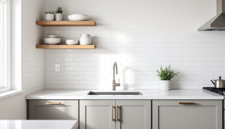
Analogous schemes use three to five colors sitting next to each other on the wheel, like yellow, yellow-orange, and orange, or blue, blue-green, and green. These palettes feel naturally harmonious, similar to how earth tones work together in a rustic kitchen. They’re common in home and lifestyle sites because they evoke comfort without jarring contrasts.
When working with these color schemes examples, many designers reference proven combinations from trusted sources. Publications like House Beautiful regularly showcase color palettes that translate well from physical interiors to digital spaces, offering tested combinations that resonate with home design audiences.
Choosing Colors That Reflect Your Brand and Audience
Your color scheme should align with both your content focus and your readers’ expectations. A site focused on budget DIY projects and reclaimed materials might lean toward warm, weathered tones, ochre, terracotta, charcoal. One covering luxury renovations and smart home tech could favor cooler, more polished palettes with metallics and deep jewel tones.
Consider your audience’s context. Homeowners researching kitchen remodels at 10 PM after the kids are in bed need easy-to-read layouts with comfortable contrast. Contractors checking measurements on a sunny job site need color combinations that remain legible on mobile screens under glare. Test your palette in different lighting conditions and on multiple devices, just like you’d check paint samples in north light versus afternoon sun.
Cultural and psychological associations matter, though they’re not universal. In Western contexts, blue conveys trust and stability (why so many banks use it), green suggests growth and eco-consciousness, and red signals urgency or importance. For a home website, greens and earth tones reinforce organic and sustainable themes, while grays and whites project modern minimalism.
Don’t ignore existing brand assets. If you’ve already got a logo, business cards, or a vehicle wrap, your website palette should incorporate those colors. Consistency builds recognition. If your logo features a specific shade of teal, make it a primary or accent color on your site rather than introducing a completely unrelated scheme.
Finally, think about color accessibility. Roughly 8% of men and 0.5% of women have some form of color vision deficiency, most commonly red-green. Avoid relying solely on color to convey information (like red for errors, green for success). Use icons, labels, or pattern fills as well. Tools like Color Oracle simulate various types of color blindness so you can check your work before launch.
Tools and Resources for Creating Your Perfect Palette
You don’t need design software or a degree to build a professional color scheme. Free web-based tools handle the heavy lifting, letting you experiment with combinations and extract precise hex codes for implementation.
Adobe Color (formerly Kuler) is the industry standard. Upload an inspiration photo, a room you designed, a piece of fabric, a landscape shot, and it extracts a five-color palette. You can also start with a base color and generate complementary, analogous, triadic, or custom schemes using the interactive color wheel. The tool shows color values in hex, RGB, CMYK, and HSB, so you’ve got what you need for CSS or design handoffs.
Coolors excels at rapid palette generation. Hit the spacebar to cycle through random five-color schemes until something clicks, then lock individual colors you like and keep generating around them. It’s fast, intuitive, and includes contrast checker tools for accessibility. Export options include PDF, PNG, and code snippets.
Paletton focuses on color theory relationships. Choose a scheme type (monochromatic, complementary, triadic, etc.), pick your base hue, and it generates a full palette with multiple tints and shades for each color. The preview pane shows how your palette looks applied to a sample website layout, helpful for visualizing before you commit.
For hands-on inspiration beyond digital tools, resources like proven color combinations provide tested palettes that translate well from interior spaces to web design, offering a bridge between physical and digital color planning.
Chrome DevTools and browser extensions help you reverse-engineer palettes from sites you admire. Right-click any element, select “Inspect,” and the Styles panel reveals the exact hex or RGB values in use. Extensions like ColorZilla let you click any pixel on a webpage and grab its color code instantly, useful for building swatches from competitors or inspiration sites.
Once you’ve settled on a palette, document it. Create a simple style guide listing each color’s hex code, its intended use (primary, secondary, accent, background, text), and any contrast ratio notes. This prevents drift as your site grows and makes life easier if you bring on help or need to match colors in graphics, social media assets, or email templates.