Table of Contents
ToggleKitchen wall tiles aren’t just a backsplash afterthought. They’re the workhorse surface that protects drywall from grease splatter, steam, and water damage while defining your kitchen’s character. Whether someone’s flipping a rental or committing to a decade-long design, tile choices affect maintenance, resale value, and daily usability. The right tile can make a cramped galley kitchen feel airy or turn a builder-grade box into something worth showing off. In 2026, the options go far beyond white subway tile, though that’s still a solid choice. Here’s how to pick kitchen wall tiles that work as hard as they look.
Key Takeaways
- Kitchen wall tiles protect drywall from grease, steam, and water damage while enhancing both functionality and resale value through intentional design.
- Subway tile remains the top choice for 2026 due to its affordability, versatility, and low-maintenance properties across modern and traditional kitchen styles.
- Geometric and patterned tiles like hexagons and zellige work best as accent zones rather than full-wall coverage to avoid visual overload.
- Material selection matters: ceramic suits most kitchen walls affordably, while porcelain, glass, and natural stone each offer trade-offs in cost, durability, and installation complexity.
- Glossy finishes brighten small spaces and simplify cleaning, while matte and textured tiles hide imperfections but require more maintenance in high-splash zones.
- Running bond and stacked patterns are forgiving for DIY installations, while herringbone and diagonal layouts demand precision and increase material waste by 15–30%.
Why Kitchen Wall Tiles Matter More Than You Think
Kitchen walls take a beating. Cooking oil atomizes into a fine mist that settles on everything within six feet of the stove. Boiling pots send steam and condensation upward. Sink areas get splashed dozens of times daily. Painted drywall absorbs all that moisture and grime, leading to staining, mildew, and frequent repaints.
Tile creates a non-porous barrier that’s easy to wipe down. Glazed ceramic and porcelain won’t harbor bacteria or absorb odors the way porous surfaces can. That’s not just cosmetic, it’s a functional upgrade that makes cleaning faster and more effective.
From a resale perspective, tiled backsplashes and accent walls signal intentional design. Appraisers and buyers notice finished surfaces. A well-executed tile installation suggests the rest of the home has been maintained with care. Conversely, bare drywall or peel-and-stick solutions behind the range can raise questions during inspections.
There’s also the structural angle. Tile protects the wall substrate. If someone’s working with a wood-framed wall behind the sink or range, moisture penetration can lead to rot or mold within the cavity. Tile, paired with a proper waterproof membrane like RedGard or Kerdi, keeps moisture on the surface where it belongs.
Popular Kitchen Wall Tile Styles for 2026
Subway Tiles: Timeless and Versatile
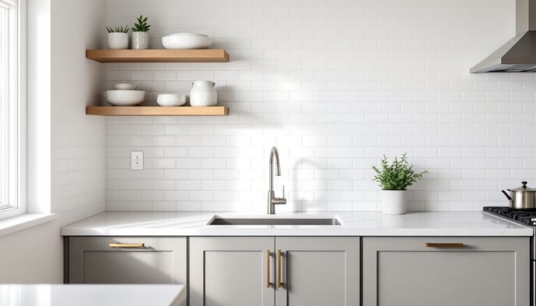
Subway tile, typically a 3″ × 6″ rectangular ceramic tile, remains the go-to for good reason. It’s affordable, widely stocked, and pairs with nearly any cabinet style. The format originated in New York City subway stations over a century ago, chosen for durability and ease of cleaning. Those same qualities work in kitchens.
Standard installation uses a running bond (brick-like) pattern with 1/8″ grout lines, which minimizes grout maintenance. White subway tile with bright white grout creates a clean, almost clinical look. Off-white or gray grout softens the contrast and hides staining better over time.
Variations abound. Beveled-edge subway tiles catch light differently than flat versions, adding subtle dimension. Hand-glazed or crackle-glazed versions introduce texture without pattern overload. And while 3″ × 6″ is classic, oversized subway tiles (4″ × 12″ or even 4″ × 16″) reduce grout lines and speed installation.
Subway tile works well in both modern and traditional kitchens. Pair it with Shaker cabinets and quartz counters for a transitional look, or use dark grout and matte black fixtures for an industrial vibe. It’s a safe choice that won’t feel dated in five years.
Geometric and Patterned Tiles
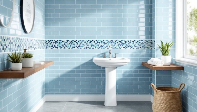
Hexagons, arabesque (lantern-shaped), and zellige (handmade Moroccan-style) tiles bring visual interest without requiring wallpaper or paint. These styles work best as accent zones, behind the range, above the sink, or on a single feature wall, rather than covering every vertical surface.
Hexagon tiles (typically 2″ or 4″ across) create a honeycomb effect. Penny rounds (small circular tiles) offer a similar density but with softer geometry. Both require more grout, which means more cleaning but also more opportunity for color contrast. Concrete-look hexagons with charcoal grout feel modern: glossy white penny rounds with white grout lean vintage.
Zellige tiles have an irregular, hand-formed surface with glaze variations. They’re trendy in 2026 but require realistic expectations. The “imperfect” finish is intentional, and lippage (uneven tile edges) is common. Installers need to work slowly and expect more waste. They’re beautiful but not beginner-friendly for DIY installs.
Patterns like herringbone or chevron can be achieved with rectangular tiles laid at angles. This adds labor time, figure 25–30% more than straight patterns, but the result is a high-impact design element that draws the eye. Use it sparingly: too much pattern competes with cabinetry and countertops.
Choosing the Right Material for Your Kitchen Wall Tiles
Ceramic is the baseline. It’s a clay-based tile fired at lower temperatures, making it less dense and more affordable than porcelain. For wall applications (not floors), ceramic works fine. It’s lighter, easier to cut with a manual snap cutter, and available in countless colors and finishes. Expect to pay $2–$8 per square foot for standard ceramic, not including installation.
Porcelain is denser and more water-resistant due to higher firing temperatures. It’s overkill for most kitchen walls unless someone’s tiling a wet area like a butler’s pantry with a sink that sees heavy use. Porcelain costs $5–$15 per square foot and requires a wet saw for clean cuts, angle grinders or snap cutters tend to chip the edges.
Glass tiles reflect light beautifully and come in metallic, iridescent, or frosted finishes. They’re popular as accent strips or full backsplashes in contemporary kitchens. The downside: they telegraph any imperfection in the wall substrate. If the drywall isn’t perfectly flat, the tiles will show waviness. Glass also requires white thinset mortar: gray mortar shows through and dulls the color. Installation is trickier, tiles slide easily before the mortar sets, and cutting them without chipping takes practice.
Natural stone, marble, travertine, slate, adds texture and organic variation. But stone is porous and requires sealing before grouting and periodic resealing thereafter. Acidic foods (tomato sauce, citrus, vinegar) can etch polished marble. Honed or tumbled finishes hide wear better. Stone tiles also vary in thickness, making lippage an issue if the installer doesn’t use leveling clips.
Cement tiles (encaustic tiles) are having a moment. They’re made from pigmented cement rather than fired clay, resulting in bold, saturated patterns. They’re not glazed, so they’re porous and must be sealed. Cement tiles are heavy, brittle, and expensive ($12–$25 per square foot), but they deliver a one-of-a-kind look.
Color and Finish Options to Elevate Your Kitchen
White and off-white remain dominant for a reason: they brighten tight spaces, pair with any cabinet color, and don’t compete with countertops or hardware. Bright white feels crisp and modern. Warm whites (with cream or gray undertones) soften the look and hide grout staining better.
Gray and greige tiles bridge the gap between cool and warm palettes. Light gray subway tiles with white grout create subtle contrast: dark gray tiles with matching grout feel moody and dramatic. Greige (gray-beige hybrid) works in kitchens with wood tones or brass fixtures.
Bold colors, navy, emerald, terracotta, black, work best as accents. A navy zellige backsplash behind white cabinets becomes the focal point. Full-wall applications of dark tile can shrink a space visually unless there’s ample natural light. When using saturated colors in kitchen design, balance them with neutral cabinetry and countertops.
Finish affects both appearance and maintenance. Glossy (glazed) tiles reflect light, making small kitchens feel larger, and they’re easiest to clean, grease wipes off with minimal effort. Matte tiles hide water spots and fingerprints but can absorb stains if the glaze isn’t rated for wall use. Textured or relief tiles add dimension but collect grime in the grooves: they’re better suited to low-splash zones away from the cooktop.
Metallic finishes, copper, bronze, brushed gold, add warmth and pair well with industrial or transitional styles. But they show water spots and require frequent buffing. Use them as accent strips rather than full coverage.
Layout Patterns That Make a Statement
Running bond (brick pattern) is the default for subway and rectangular tiles. Tiles are offset by half, like bricks in a wall. It’s fast to install and visually balanced. Start with a level line at the counter or midpoint, not the ceiling, ceilings are rarely level.
Stacked (grid pattern) aligns tiles vertically and horizontally. It looks modern and geometric but highlights any deviation from square. If the wall or tile isn’t perfectly cut, gaps and misalignments become obvious. Use tile leveling clips (like Raimondi or QEP systems) to maintain consistent grout lines.
Herringbone arranges rectangular tiles in a V-shaped zigzag. It’s eye-catching and works well with subway or plank-format tiles. Herringbone requires precise cuts at edges and corners, so plan for 15–20% waste. Start from the center of the wall and work outward to keep the pattern symmetrical.
Vertical stack (running bond turned 90 degrees) elongates walls visually, useful in kitchens with low ceilings. It’s a subtle twist on the classic horizontal layout and uses the same tile.
Diagonal patterns (45-degree angle) add movement but increase cutting and waste. They work best with square tiles. Diagonal layouts make small tiles look busy, so stick with 4″ × 4″ or larger formats.
Mixed patterns, like a field of subway tile with a row of hexagons as a trim or border, add custom detail. Plan transitions carefully: mixing tile thicknesses requires shimming or profiled edge trim.
For DIY installs, pick a pattern that matches skill level. Running bond is forgiving. Herringbone and diagonal patterns demand patience and a wet saw. If someone’s new to tiling, exploring layout ideas through design resources before committing to a pattern can prevent costly mistakes.
Always dry-lay tiles (set them without mortar) first to check spacing, cuts, and pattern alignment. Adjust the layout to avoid narrow slivers at edges, those are hard to cut and look unfinished.